What an awesome time we had. The Hotel was spectacular, the food absolutely fantastic and the conversations wonderful. We walked a lot and every night watched the Olympics from our beautiful room. The Hotel fort Garry is known for their coffee and tea trays. You don't have the option to make coffee/tea in your room. In stead, you phone and they deliver the most beautiful tea tray warm and fresh to your door. Complimentary. The breakfasts was delightful: you order your omelet from the chef and watch him make it in front of you... almost like a reality tv show. We dined on night at Sidney s at the forks and we could stop ourselves from oooh-ing and aaaah-ing at the food. and the service. and the incredible atmosphere and (almost minimal) decor. I had the Wild mushroom velouté, the Homemade farfalle pasta with roasted red pepper & exotic mushrooms tossed in a broccolini pesto sauce topped with feta... for the entree I loved the New Zealand lamb shank confit finished with sundried chokecherry demi-glace and for desert the Classic crème brulée (of course) but I must admit that Jaku's cheesecake was way better.
The picture here was taken at one of our many starbucks shenanigans and I just love it! Oh and did I mentioned that we spoiled ourselves with some back and neck massages? mmmm, that was amazing! The ten spa is one of the most beautiful spa's that I have ever seen!
The forks in Winnipeg is such a happy place. It reminded us A LOT of Granville island in Vancouver, just on a smaller scale. It was so nice and hot while we were there and the holiday atmosphere was contagious. The scenery was beautiful. Sigh. I wish you were there!
All of you who wanted a post card, please email me your addies and I will get those in the mail ASAP.
Have a wonderful day!
Love and a kiss
Wilna
x
Tuesday, August 19, 2008
Thursday, August 14, 2008
One thing that we all appreciate about being scrapbookers is how our style and techniques seem to be evolving continuously. Today I want to share with you a few of my favorite techniques that I am using over and over again! I find that if I really like a technique I am not ashamed to use it on every single page until I get tired of it! On this one page, I want to show you 4 of my best loved super easy techniques.
Have I told you lately that I LOVE YOU?
1. The first idea is one of layering. I find lately that I absolutely cannot make up my mind about which papers I want to use. So I would use strips of 6 or 7 papers and layer them. The next picture is how I would layer different patterned papers and different die-cut papers. I love the combination of textures. In this case I used mainly Making Memories Passport and New Noteworthy papers.
(fig 1: the layers)
To make sure that all the papers stay together and to make it easier for me to work with, I stitched them together.
(fig 2: stitching the layers)
2. Stamping on printed paper. I bought this old book from a second hand store for 50c and I love using it's pages to give that touch of intrigue to my scrapbook pages. I used the Making Memories Classic Mixed Alpha's to stamp on the printed paper. Then I simply cut the letters out and using a pop dot, adhere it to the scrapbook page.
(fig 3: Stamping in the book)
(fig 4: Cutting the letters and using a pop dot to adhere)
3. Textbook hearts. I am so in love with making these simple embellishment on my pages and even in the cards I have been making lately. I would take a few pages and while holding them together, cut out a heart (or a butterfly) and then I would adhere it to my page by stitching it right in the middle. Make sure you "flap" the pages of the heart to give it that 3D look.
(fig 5: Stitching right through the middle of the heart)
4. Mini Alphas. While this is not so much a technique as a product love affair, I still find my self on every page lately using these tiny alphas to say that which is important, but not too obvious.
(fig 6: Using tiny alphas)
I hope that can use one (or all) of these techniques. I would love to see your take and variations of these methods!
Love and a kiss
Wilna
x
Thursday, December 14, 2006
removing the lines from your banner
If you want to remove those grey borders around or behind your banner with your blog title, go to
TEMPLATE-------> HMTL code
then select and delete this section:
/* Header
-----------------------------------------------
*/
#header-wrapper {
width:700px;
margin:0 auto 10px;
border:1px solid $bordercolor;
}
#header {
margin: 5px;
border: 1px solid $bordercolor;
text-align: center;
color:$pagetitlecolor;
}
#header h1 {
margin:5px 5px 0;
padding:15px 20px .25em;
line-height:1.2em;
text-transform:uppercase;
letter-spacing:.2em;
font: $pagetitlefont;
}
#header a {
color:$pagetitlecolor;
text-decoration:none;
}
#header a:hover {
color:$pagetitlecolor;
}
#header .description {
margin:0 5px 5px;
padding:0 20px 15px;
max-width:700px;
text-transform:uppercase;
letter-spacing:.2em;
line-height: 1.4em;
font: $descriptionfont;
color: $descriptioncolor;
}
Monday, December 11, 2006
Removing the blog header
have you switched to beta blogger?
if you still have problems, please look here for a solution.
http://help.blogger.com/bin/topic.py?topic=9085
Wednesday, November 22, 2006
Friday, November 17, 2006
Web counter
I have a web counter with APOLLO find and i love it. it's free and fascinating.
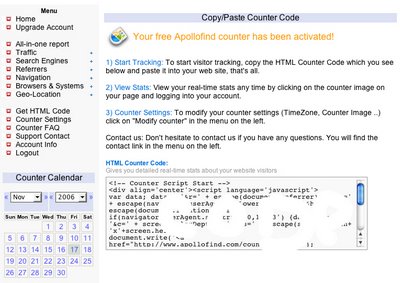
If you want one go and register. Copy the HTML code:
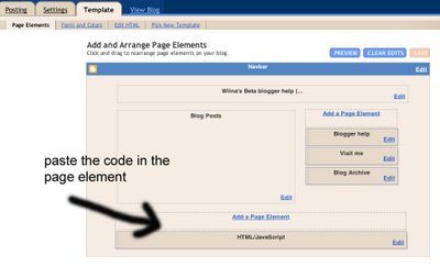
and paste it in a page element. Go to template> at the bottom (for a footer) or side (to have the counter in your sidebar) click "add a page element" choose a HTML/Java option. paste the code there.
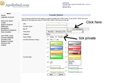
in the apollofind site just do the following:
Tick private if you want the stats only for your own eyes.
Click on "get my address" so that the counter bans your own IP address so that it doesn't count you every time you go to your own blog.
TADA!!!!!!!!!
let me know if you found this helpful.
Subscribe to:
Posts (Atom)